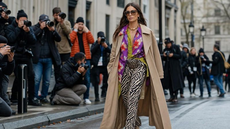
Scroll any Fashion Week sidewalk and you’ll see it instantly: clashing prints, electric color, textures piled on textures. Not chaos, but a very deliberate kind of noise. For models and creators, those sidewalks function like an open casting, and the people getting photographed most aren’t always in head‑to‑toe black. They’re the ones using print, pattern, and color as a personal logo.
The question isn’t just “can clashing be tasteful?” but “can it sell a casting‑ready personal brand?” The answer, judging by street style regulars, stylists, and a few very successful bloggers‑turned‑businesswomen, is yes — if you treat clashing as strategy, not costume.
From 90s minimalism to tasteful clashing
The 1990s set a long‑running standard for polish: the perfect white T‑shirt, straight‑leg jeans, a good knit. That minimalist uniform still has its place, especially for digitals and clean commercial work, but around the shows the mood has shifted. Street style photographers now chase looks that layer geometrics over florals, animal print with checks, cherry red against acid green.
What’s changed is the attitude toward “rules.” Instead of rigid prescriptions — no navy with black, no mixing florals, no white after Labor Day — Fashion Week street style has turned into a buffet of patterns and colors. Yet the best outfits aren’t random. They follow quiet guidelines: mixing prints of different scales so they don’t visually fight, keeping one cohesive color story running through the look, and using neutral shoes or outerwear as an anchor. That’s what makes clashing feel intentional, not chaotic, on camera.
Street style as the new open casting
Outside the shows, the pavement is a live mood board for the industry. Photographers, editors, casting teams, and brand reps scan the crowd long before the runway starts. A memorable clashing‑prints street style look can end up in a global slideshow, pinned to a creative director’s reference deck, or quietly bookmarked by a casting director looking for “that girl in the green check coat and tiger‑stripe skirt.”
Chiara Ferragni is the textbook example of how that visibility can turn into business. She launched her blog The Blond Salad in 2009, leaning heavily on bold, camera‑friendly outfits and relentless street style coverage. Within a few years she moved from sidewalk subject to front‑row regular, then made history as the first blogger to land a Vogue Spain cover. Reports put her brand’s revenue around €6 million in 2014, backed by an Instagram audience in the millions. None of that happened by accident: her looks were colorful, pattern‑heavy, and above all consistent enough to be instantly recognizable from across a street.
What “casting‑ready” actually means
For working models, “casting‑ready” sits in a sweet spot. You need to be memorable, but you also need to be legible. A client has to be able to picture you in their world without fighting through an outfit that feels like pure performance.
That’s where stylists who think in terms of personal branding, not just outfits, come in. Nashville‑based wardrobe stylist Molly Russell, for example, works with “people of influence” — new moms, pro athletes, executives — to build what she calls modern, classic street style. Her process is methodical: she starts with a style mood board, edits the client’s closet, shops to fill the gaps, then photographs more than 50 mix‑and‑match looks into a personal lookbook, and maintains the wardrobe over time. She favors a mix of high and low pieces and focuses on “fewer better things” that align with body type, lifestyle, and brand.
That same logic applies if you’re a model or creator building a casting‑ready look. Strategic clashing should grow out of a clear style strategy: what roles you want to book, which brands you want to attract, and how you want people to describe you in one line. Are you graphic and sharp? Soft and romantic? Sporty and playful? Your prints and colors should repeat those adjectives visually, season after season.
A stylist’s framework for strategic clashing
Think of strategic clashing as a formula you can tweak, not a gamble you take five minutes before a show. A simple framework:
1. Start with a hero print. Choose one piece to do the loudest talking — a plaid coat, a bold floral skirt, a zebra‑stripe shirt. That’s the focal point you want photographers (and clients) to remember. Keeping the “hero” to a single garment prevents your look from tipping into costume.
2. Add a supporting print in a different scale. If your hero piece has big, open shapes, support it with a smaller, tighter pattern: wide stripes with micro‑polka dots, oversized checks with a fine pinstripe, large florals with a tiny geometric. Let the two share at least one color, so the eye reads them as a family, not a fight.
3. Anchor everything with neutrals and clean lines. Make at least half of the outfit solid and familiar: a black or camel coat, straight dark denim, a white tank, simple boots or sneakers. Tailored silhouettes and classic shapes reassure nervous clients that you can look sharp and professional even when your prints are adventurous.
4. Edit for the camera. On street style days and go‑sees, do a quick phone test before you leave. Check that your patterns don’t create strange moiré effects on video, that messages or logos aren’t distracting, and that your face isn’t competing with your clothes. If the outfit is the only thing you see in the frame, strip back one element.
Boiled down, one reliable recipe for clashing prints street style is: hero print + supporting print + 60% neutral base + one accent color you repeat in your bag, lip, or nails.
From outfit to visual portfolio
What turns all this pattern play into real career capital is documentation and repetition. Stylists like Molly Russell literally archive outfits for clients; her lookbooks log dozens of combinations so they can get dressed quickly and consistently. You can do a lighter version for yourself.
Set aside an afternoon to shoot 15–20 clashing looks that feel like “you.” Use natural light and simple backgrounds, and capture full‑length plus close‑ups. Save them in albums labeled by vibe: “commercial castings,” “fashion week street,” “brand events,” “off‑duty.” Over time, you’ll see which prints and color stories photograph best and actually get you compliments, reposts, or call‑backs.
Then, curate. Pick a small set of signature elements — maybe stripes and checks, or florals and graphic color‑blocking — in two or three key colors. Let those show up again and again across your street style, test shoots, and social grid. That kind of visual consistency is what made someone like Chiara Ferragni instantly recognizable, and it’s what makes a casting director remember you after scrolling through hundreds of faces.
If you treat clashing as a deliberate language instead of a dare, print, pattern, and color stop being “too much” and start working like a logo: a fast, legible sign that you’re creative, self‑aware, and ready for the job.